JY Koliba


koliba
Jure Stojan, 2000-1

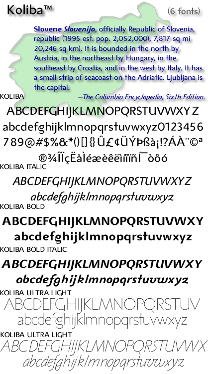
Inspired by architecture and hand-lettered posters of the 1940s,  Koliba makes a statement that is very 21st century. With an ultra-light  weight plus an elegant book and bold, Koliba was designed to be flexible.  Fine-tuned with between 2,800 and 3,330 kerning pairs per font, a  full Latin glyph complement (with proper Unicoding for Windows TrueType),  and Windows TrueType kerning support fr designer Jure Stojan's Slovenian  mother tongue, Koliba is set to be one of the foundry's best-loved  sans serifs.

136 JY Koliba OT Ultra Light, Ultra Light Italic, Roman, Italic, Bold, Bold Italic 

136samp5
136samp4


136samp3
136samp2

Top The  two extremes of weight: for the first time in a JY&A font, an  ultra light weight, while Koliba Bold and Bold Italic provide impact  without being overbearing. Above Romans are accompanied by lining figures, while italics have oldstyle. Below The hand-drawn inspiration  is apparent in both the italic, where fg are particularly sweeping,  and in the roman, which appears structured as one would expect from  architectural lettering.s

Copyright©1998-2011 by Typos Type & Image Design. All rights reserved. The Typos symbol is the property of Typos Type & Image  Design.

vorherige Seite