 |
|||||||||||||||||||||
|
|
|||||||||||||||||||||
|
|
|||||||||||||||||||||
|
|
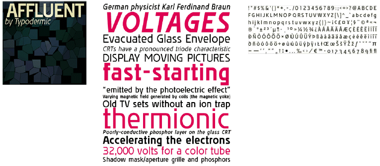
AffluentAre you tired of blurry fonts on your TV or computer screen? Do you wish there was a font that stayed crisp and clear in video games? Do you want your DVD menus to be easier to read on-screen? Well, your wish just came true! Affluent is unique because it was tailor-made to stay razor-sharp on screen keeping text clear and readable from a distance even at small sizes. Want to create dramatic high contrast titles? Affluent Demi-bold has a little more weight for when you want dark coloured letters that won't sink into bright video backgrounds. How does Affluent work? The horizontal details of most regular fonts are lost on TV screens and monitors because the electron beam creates horizontal smearing as it refreshes the raster lines. Freed from unnecessary details that mar other fonts when rendered on TV, Affluent maintains long horizontal lines and sharp transitions on curves to compensate for the phosphor glow on the rounded corners of standard fonts. Widened diagonal intersections prevent onscreen fill-in that clogs regular fonts. Truncated ends on the âaâ™ and âeâ™ enable them to be easily discerned from one another at small sizes. This makes Affluent ultimately reliable on-screen even in fine print. Use it on DVD menus, TV text, video terminals and kiosks, web design, public video displays and on any videogame console. Affluent isn't just for on-screen use. It works in large or small print when you want readability in a form-follows-function contemporary, utilitarian style. When you want your words to be legible, on screen and in print, choose Affluent. |
 |
|
|
|
|