 |
|||||||||||||||||||||
|
|
|||||||||||||||||||||
|
|
|||||||||||||||||||||
|
|
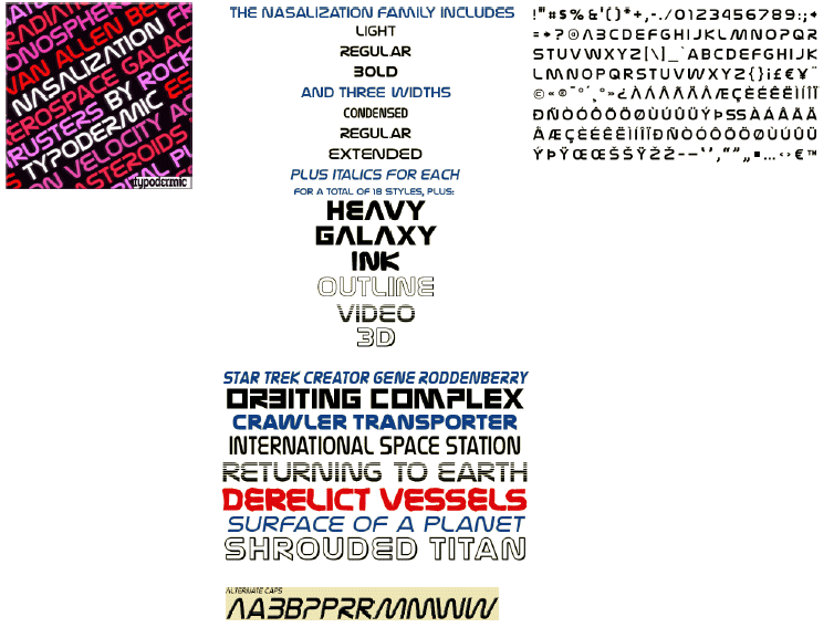
NasalizationOne small logo for NASA, one giant font for mankind! Nasalization retains the feel of the 70â™s American Space Program while setting its sights on the future with its clean, streamlined design. For an oblique look there are italics for most weights and widths. For even greater flexibility there are alternate characters; barred and non-barred A, open and closed B, P and R and left leaning M and W. Available in 4 weights plus: Outline, 3D, Video, Galaxy and Ink. Each style has a payload of numerals and alternate characters. Ideal for headlines, retail product packaging and even neon signage, Nasalization looks retro and futuristic at the same time. When your message needs to aim high and go far: choose Nazalization. |
 |
|
|
|
|