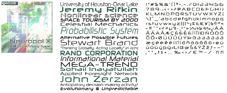
Neuropol X
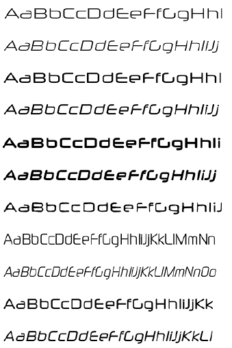
Neuropol is a futuristic font family inspired by science fiction video games and flatbed plotters. Designed by Ray Larabie in 1997, the original Neuropol was an instant hit with younger graphic designers, neatly filling the void between Microgramma, the universal geometric sans serif of the late 20th century, and the fast-approaching 21st century.
If the 1990s was the decade der alte, Neuropol responded with everlasting style; simple right angle joints supplanted ink traps, and certain strokes were shrewdly cut short. Graphically Neuropol reflects the rapid cultural change and fusion of ideas sparked by the internet, being widely used to promote music, clothing, electronics and techno-toys.
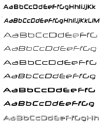
The 2002 revamp of Neuropol addresses prior deficiencies and expands the family with two additional fonts: Neuropol X, and Neuropol Nova.
Neuropol X is reconstructed from the ground up with many new features and enhancements.
- neater, cleaner curves
- thickened uppercase stems
- improved spacing-looser than original
- full Latin character set-all symbols & accents
- kerned accents
- closed roof âzâ™
|


