Pakenham
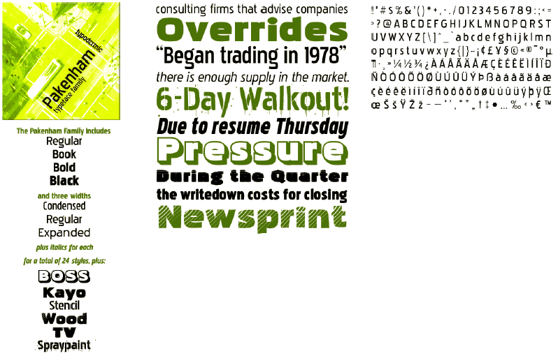
Pakenham was inspired by Paul Renner’s 1950s creation, Steile Futura. This sans serif font has an upright, modern look with gently turned corners and generously proportioned loops. The overall appearance is squarish and quite compact but friendly and with 30 styles, there is sure to be at least one that will suit your project.
There are 4 weights: regular, book, bold and black and 3 widths: regular, condensed and expanded. There are italics for most styles and 8 special effect styles:
Kayo is ultra-big and wide when you want the heaviest heavy.
Boss has an outline with drop shadow for a 3 dimensional look.
Ink looks as if it was printed on an old printer and smeared.
Gaunt has been dieting too long and has become spindly and brittle.
Wood has a diagonal pattern to simulate wood grain.
Stencil could have been cut out of paper or metal with vertical supports.
Spraypaint is the result of using a stencil and too much paint.
TV needs a better antenna.
All 30 styles have full upper and lower case, numerals, accents and punctuation. Pakenham may not be outstandingly different but it’s very readable and versatile. Use it on personal or business correspondence when you want a change from the usual. It looks good at large sizes on billboards and signage and is readable at small sizes in body text, ad copy, headlines, flyers, posters and packaging.
|

