|
Sui Generis
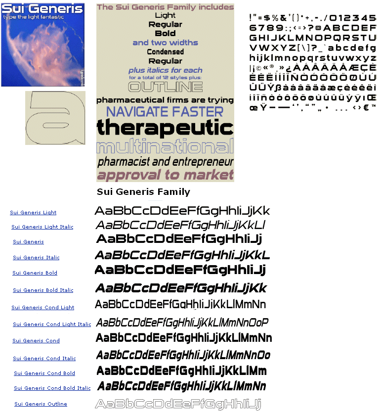
Analysis of Sui Generis will prove that it’s a sans serif font generally located at the top of an article or page. In laymanâ™s terms; it’s a headline font. Consider the facts:
- The ascenders have charming slanted ends
- Some of the lowercase letters have dimples to increase their adorability factor.
- It tastes like chicken.
- Available in 3 weights and 2 widths, plus italics for each, Sui Generis has upper and lower case, numerals, accents and punctuation. This font is available in OpenType, TrueType and PostScript for both Mac and Windows.
- Sui Generis is particularly suited for display work where a futuristic or scientific feel is required. Sui Generis is great for headlines. Use it on packaging to make your product look like it came straight from the lab.
- In conclusion, it can be categorically stated that Sui Generis will elevate your design from ordinary to kick-ass.
|

