 |
|||||||||||||||||||||
|
|
|||||||||||||||||||||
|
|
|||||||||||||||||||||
|
|
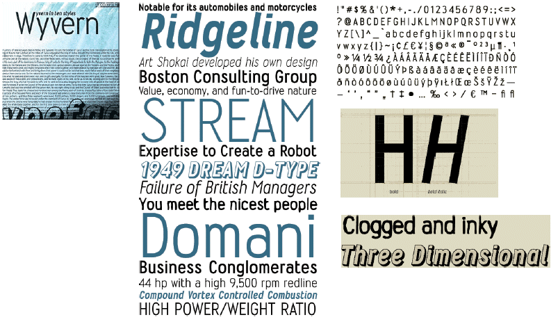
WyvernWhen I designed Wyvern, the first font for the Typodermic foundry, I originally had Letter Gothic in mind, side-by-side they look quite dissimilar. The width of the capitals varies quite a bit; the M is very wide while the B is quite narrow. In ALL CAPS it creates a pleasant rhythm. The wide M looks well balanced in front of lowercase letters. The wide S is a perfect companion to the matching proportions of the lowercase s. Wyvern comes is four weights: light, medium, bold and heavy. Wyvern italics aren't merely oblique, they have angled stroke ends and curves adjusted to give it a humanist quality. The bold and heavy weights have ink traps for better performance in print at small point sizes. Wyvern is an economic (space saving) typeface. You may prefer to set if more loosely in applications where space is not at a premium. |
 |
|
|
|
|